 It’s a sad tale we’ve heard time and time again in this industry: “my ad gets hundreds of clicks, but almost no conversions.” After triple-checking for broken links or faulty submission buttons and re-analyzing your target audience, you’re left wondering why your visitors still aren’t converting.
Something must have happened while these visitors were on your landing page. Maybe they each experienced web outages at the exact moment they were submitting your form. Perhaps Chrome, Safari and FireFox web browsers everywhere crashed and prevented anyone from completing the form. (It could happen, right?!)
As convenient as those scenarios would be, unfortunately, the more plausible answer is that – (bear with me here) – you are sabotaging your own landing page.
Don’t worry. It happens to the best of us. And as luck would have it, the self-sabotage is typically pretty easy to identify. If you’re finding yourself in this my-landing-page-isn’t-converting rut, let’s talk about a few of the most common mistakes we’ve seen plenty of businesses make.
#1: Loading Time Lag
Sometimes we are surprised how often we still see this problem affecting landing pages. Your time, effort and money will be wasted if your visitor leaves before your landing page finishes loading. As the digital space evolves, user expectations on load times becomes much more demanding. According to Google, 53% of users will leave a site if it takes more than three seconds to load. The same research shows that the average site takes 15 seconds to load. Do not let speed be your landing page killer. A few factors that might be affecting this include:
- A slow hosting provider
- Poor image optimization
- Unclean web code
- Too many server requests
- Gigantic web files
Speed test your load times regularly and aim for the 2-3 second sweet spot. Run a quick test with Google’s free tool to see how your website is doing.
#2: A Disconnect From Your Ad Design
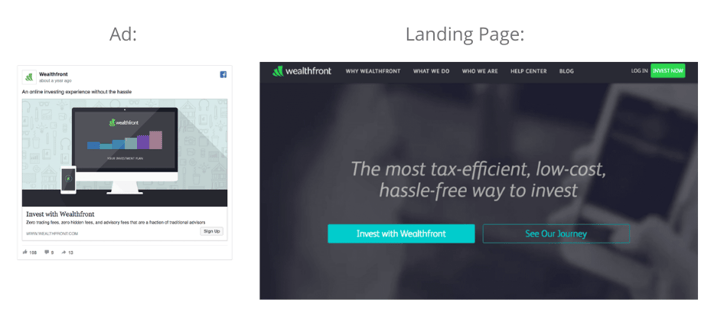
When you’re attracting hundreds of clicks with your ad, but converting next to no one on your landing page, the disconnect is sometimes in the landing page design. For example, we’ve seen eye-catching, beautifully designed ads which lead to a landing page with an entirely different look and feel… creating disconnect for the user. While both might look great and follow all the best practices of designing for conversions, the graphic disconnect is enough to confuse an already aloof web user.
Let’s take a look at this example below from an old Wealthfront campaign. (source)
Their Facebook ad featured an illustrative element which didn’t carry over into their landing page at all. By merely scanning the two mediums (and let’s keep in mind that users often only scan online!), it doesn’t even appear that they’re a part of the same campaign and likely cause them to exit.
#3: Giving Your Visitor Too Many Options
Chances are your audience is a part of the general, working public who are balancing responsibilities, family time, finances, deadlines…the list goes on. Your landing page should be a simple, stress-free zone, offering clarity and a single purpose.
Likely we’ve all come across countless landing pages with far too many call-to-actions and options to choose from. For marketers and businesses alike, this leads to conversion leakage; for visitors, it’s a potentially confusing experience – one that could dissuade them from continuing on.
Don’t underestimate the value of giving your visitor less choices on a landing page. Take Geico, for instance. There is zero confusion whatsoever on what a visitor should do on this landing page. One choice is an easy conversion.

Another simple example is this Neil Patel creation for CrazyEgg. One call-to-action; one field to complete; one conversion point. Straight to the point and no conflicting noise on the page.

#4: Thinking A Mobile Responsive Design Will Cut It
Chances are many of your ads are running on social ad networks. Most of this audience, if not all, will likely be engaging through their mobile phone. And if there’s one thing about consumer behavior we want all businesses to understand, it’s this: your mobile visitors behave differently from your desktop visitors!
Mobile audiences have much higher distraction levels to compete against; their intent is different. To trust that your landing page’s desktop design will captivate a mobile audience is sabotage with a capital ‘S.’
What’s valid for desktop design will not always be valid for mobile design. Don’t leave the work to your responsive template and hope for the best. In fact, these days you should be taking a “mobile-first” approach when building not only your landing pages, but your whole website.
Take it from the authority on conversion, Neil Patel, who talks much more about this subject in “The Anatomy of a Mobile Landing Page That Converts Like Crazy.”
#5: Failing to Allow Auto Complete
I’m not going to sit here and tell you that your form is too long. That’s really up to each team to decide what customer data you need to gather. So – while shorter is typically better – if you can’t compromise on the number of fields, it’s your job to do everything in your power to make it easier for a visitor to complete your landing page form. Allowing for autocomplete is a great way to make the customer experience painless and quick.
Both Chrome and Safari (provided that the user enables the features) will support the autocomplete feature. And it’s a matter of utilizing the appropriate HTML attributes. For instance, to allow autocomplete for an email field, your HTML code would be “<input type=”email” name=”customerEmail” autocomplete=”email”/>”. (Learn more about form control here).
Additional autocomplete features can be leveraged through the users’ device features like voice, GPS and their Contacts. Put yourself in the shoes of a visitor who only has 30 seconds to spare and investigate different, creative ways you can eliminate form friction.
The best way to identify which parts of your landing page might be turning off your audience is through research. Dive deep into your data to discover their intent and what kind of friction you’re inadvertently causing. Start with one key element and tweak from there.


Stay Connected